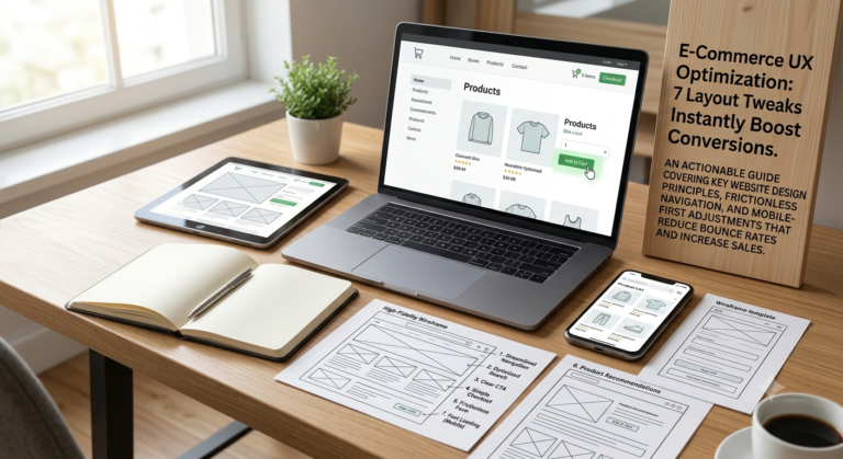
E-Commerce UX Optimization: 7 Layout Tweaks That Instantly Boost Conversions
Every e-commerce audit I’ve run starts the same way: I load the site on my phone first, not my laptop. That’s where most stores quietly lose the majority of their sales — not through bad...
-
0 comments
-
30

Every e-commerce audit I’ve run starts the same way: I load the site on my phone first, not my laptop. That’s where most stores quietly lose the majority of their sales — not through bad products or bad ads, but through small layout friction that makes a mobile shopper give up halfway through checkout.
You don’t need a full redesign to fix this. Most conversion gains come from targeted layout tweaks. Here are the seven that consistently move the needle.
1. Put Your Value Proposition Above the Fold — Literally
Visitors decide whether to keep scrolling within seconds of landing on your homepage or category page. If your hero section is a generic lifestyle photo with no text explaining what you sell or why it’s better, you’re wasting that window.
The fix: a clear headline stating what you sell and who it’s for, paired with a single supporting line on why it matters (fast shipping, unique material, price advantage). No scrolling required to understand the offer.
2. Simplify Navigation to 5–7 Top-Level Categories
Overloaded mega-menus overwhelm shoppers, especially on mobile where dropdowns are harder to browse with a thumb. Audit your navigation and consolidate categories until you have 5–7 clear top-level options. Everything else should live in subcategories or filters, not the main menu.
If shoppers can’t find what they want in two taps, they’ll bounce to a competitor whose store makes it obvious.
3. Make the Search Bar Impossible to Miss
High-intent shoppers who know what they want will search rather than browse. If your search bar is a small icon tucked in a corner, you’re forcing motivated buyers to hunt for it. Make it a full visible bar in the header, not a collapsed icon, especially on mobile where thumb-friendly placement matters most.
4. Fix Product Grid Density for Mobile
Desktop product grids with 4-5 items per row often get crammed into unreadable thumbnails on mobile. Test single or two-column mobile layouts with larger images, visible pricing, and star ratings without requiring a tap. Shoppers should be able to scan pricing and quality signals without opening each product individually.
5. Move Trust Signals Closer to the Add-to-Cart Button
Reviews, security badges, and return policy details are often buried further down the product page. But the moment a shopper is deciding whether to click “Add to Cart” is exactly when they need reassurance. Place a star rating with review count, a short shipping/returns line, and a security badge directly beside or below the CTA button — not several scrolls away.
6. Reduce Product Page Scroll Depth for Core Decisions
A shopper should be able to see the product image, price, key variant options (size/color), and the add-to-cart button without scrolling on mobile. If your layout pushes the CTA below the fold because of a long description or a large image carousel, restructure the page so the buying decision happens first, and supporting detail (specs, reviews, shipping info) comes after.
7. Sticky Add-to-Cart on Mobile
Once a shopper scrolls past the initial product view to read details or reviews, a sticky “Add to Cart” bar at the bottom of the screen keeps the purchase action available at all times. This single tweak alone frequently reduces the number of taps needed to convert, since shoppers don’t have to scroll back up once they’ve made their decision.
How to Prioritize These Changes
Not every store needs all seven at once. Start with a quick audit:
- Load your site on an actual phone, not just a browser resize.
- Time how long it takes to find a product and complete checkout.
- Note every extra tap, every moment of confusion, every place you had to scroll back up.
Fix the layout issues causing the most friction first — usually navigation and CTA visibility — then move to secondary tweaks like trust signal placement.
The Bottom Line
E-commerce conversion problems are rarely about traffic quality — they’re about how much friction stands between a visitor and the buy button. These seven tweaks aren’t flashy redesigns; they’re structural fixes that remove the small obstacles causing shoppers to abandon a purchase they were already leaning toward making.
Next in this series: Reducing Cart Abandonment — what to do once a shopper makes it to checkout but still doesn’t convert.





Latest Posts